Appearance
Typography
SYNTHEXA uses two carefully chosen font families to balance readability and retro-futurism.
Font Families
Inter — Headings & Body
Weight: Regular (400), SemiBold (600)
Use Cases:
- All headings (h1–h6)
- Body paragraphs
- Regular UI text
IBM Plex Mono — UI & Terminal
Weight: Light (300), Regular (400), Medium (500)
Use Cases:
- Terminal content and labels
- Code snippets
- UI labels and tags
- Status indicators
- Monospace aesthetic
Text Style Scale
All text in SYNTHEXA is managed via Text Styles. Never edit individual element typography — always update the global style.
Headings
| Style | Font | Size | Weight | Used For |
|---|---|---|---|---|
/Heading 1 | Inter | 72px | SemiBold | Hero headlines |
/Heading 2 | Inter | 48px | SemiBold | Section titles |
/Heading 3 | Inter | 32px | SemiBold | Card titles, subsections |
/Heading 4 | Inter | 24px | Bold | Smaller headings |
/Heading 5 | Inter | 19px | Bold | Even smaller headings |
/Heading 6 | Inter | 16px | Bold | Tiny headings |
Body Text
| Style | Font | Size | Weight | Used For |
|---|---|---|---|---|
/Body/BodyRegular | Inter | 16px | Regular | Body copy, paragraphs |
/Body/BodySmall | Inter | 14px | Regular | Supporting text, captions |
Monospace / Terminal
| Style | Font | Size | Weight | Used For |
|---|---|---|---|---|
/Mono/MonoXLarge | IBM Plex Mono | 46px | Light | Large mono display |
/Mono/MonoLarge | IBM Plex Mono | 18px | Medium | Mono headings |
/Mono/MonoRegular | IBM Plex Mono | 16px | Regular | UI labels, standard mono |
/Mono/MonoSmall | IBM Plex Mono | 14px | Regular | Tags, small labels |
/Mono/MonoXSmall | IBM Plex Mono | 12px | Medium | Meta labels, timestamps |
/Mono/MonoXXSmall | IBM Plex Mono | 11px | Regular | Terminal header/footer |
/Mono/Mono3XSmall | IBM Plex Mono | 8px | Regular | Tiny decorative labels |
How to Change Typography
Step 1: Open Text Styles
In Framer:
- Click Assets (left sidebar)
- Select Text Styles
Step 2: Select a Style
Find the text style you want to change (e.g., /Heading 1, /Body/BodyRegular).
Step 3: Edit the Style
Click to open the style editor. You can change:
- Font — Select Inter or IBM Plex Mono
- Size — Adjust point size
- Weight — Regular, SemiBold, Bold
- Color — Use a color token or custom color
- Line — Space between lines
- Letter — Space between characters
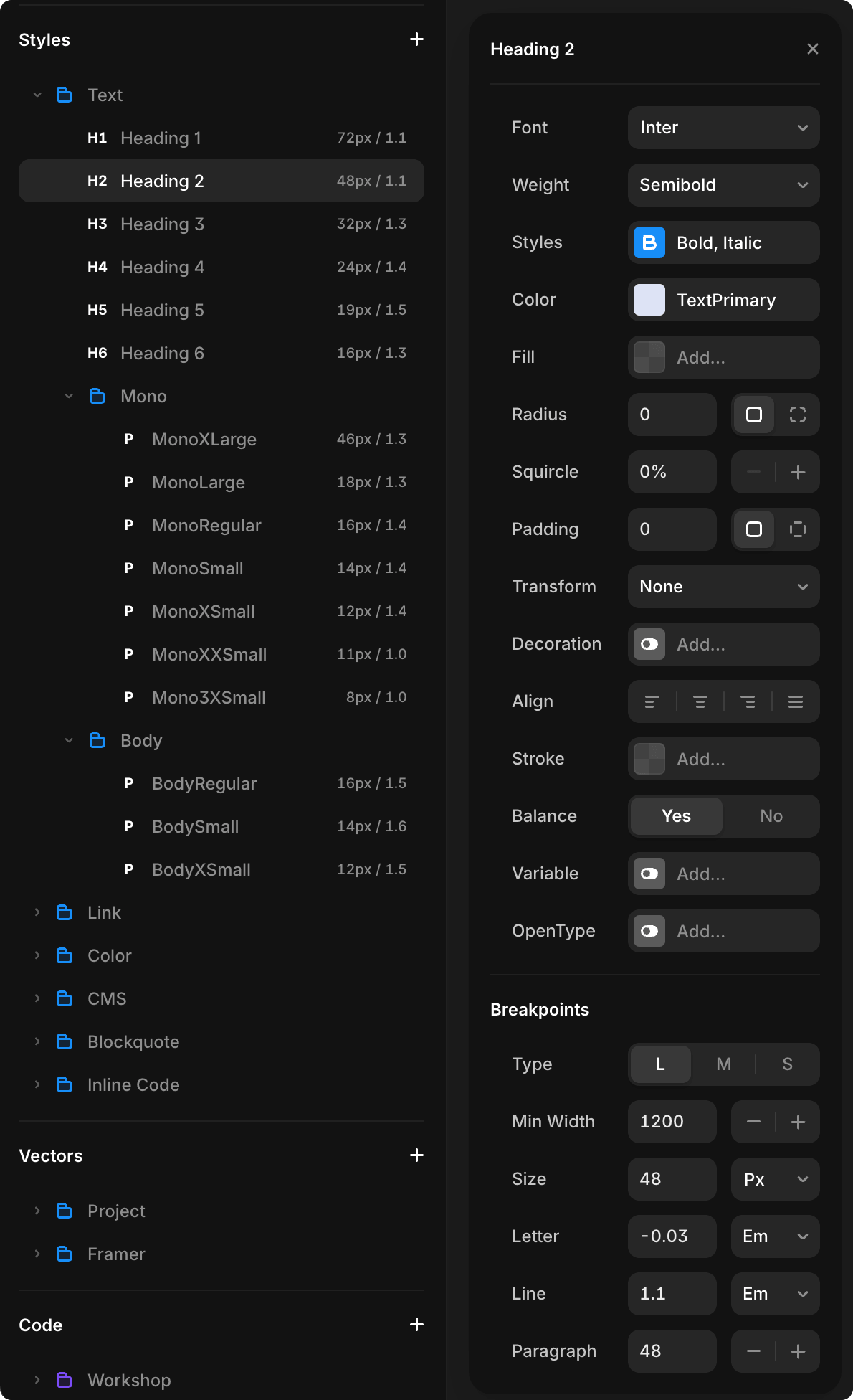
Step 4: Apply & Publish
All text using that style updates instantly across the entire site.
Click Publish to make changes live.
Responsive Typography
SYNTHEXA uses three breakpoints with text sizes configured for each:
Breakpoints
| Breakpoint | Screen Width | Use Case |
|---|---|---|
| Desktop | 1200px+ | Large screens, full layout |
| Tablet | 1199–810px | Tablets and medium screens |
| Phone | Below 810px | Mobile devices |
Each text style can have different sizes at each breakpoint. For example:
/Heading 1might be 72px on Desktop, 56px on Tablet, 38px on Phone
To configure sizes per breakpoint:
- Assets → Text Styles
- Select a text style (e.g.,
/Heading 1) - In the style editor, click the breakpoint (L/M/S buttons)
- Change the size for that breakpoint
- Publish to apply changes
This ensures typography scales appropriately across all devices without manual adjustments.
Best Practices
- ✅ Use Text Styles — Always edit the global style, not individual elements
- ✅ Consistent sizing — Follow the text style scale
- ✅ Adequate contrast — Ensure text is readable on all backgrounds
- ✅ Generous spacing — Use line-height to improve readability
- ✅ Limit font sizes — Stick to the predefined scale
- ✅ Dark mode — Test text colors in both light and dark modes
WARNING
Never change individual element typography. Always edit the Text Style. Individual changes break consistency and are harder to maintain.