Appearance
CardPattern
A versatile card component that showcases workflow patterns with interactive hover states, customizable icons, and integrated terminal aesthetics.
Overview
CardPattern displays automation opportunities and workflow examples in an engaging card format. It features three interactive variants that reveal additional terminal-themed details on hover.
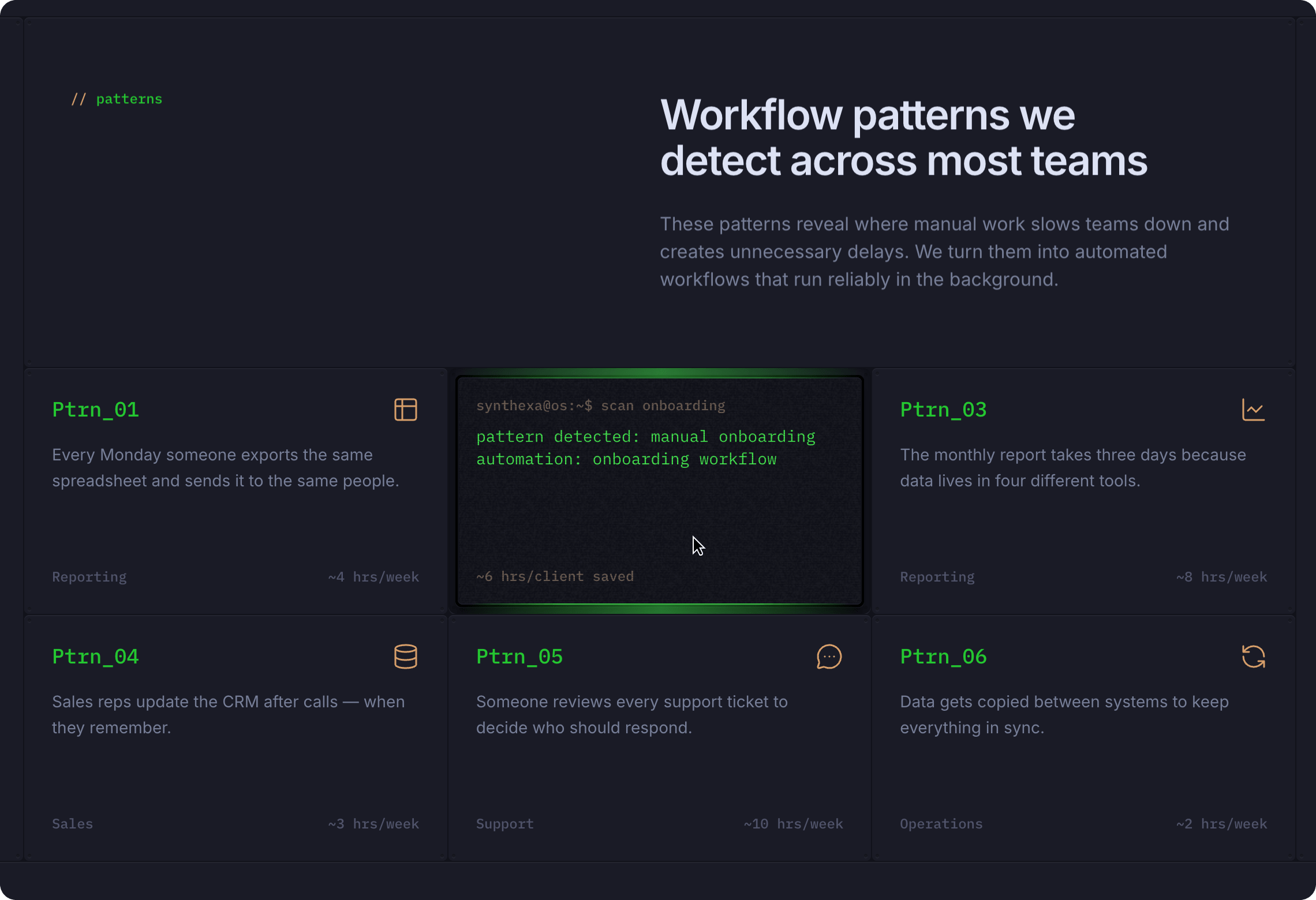
Key Features:
- Three interactive variants (Front, TerminalOff, TerminalOn)
- Customizable icon with accent color
- Terminal-themed visual styling
- Pattern name, description, and metrics
- Hover-triggered animations
- Terminal captions and detailed descriptions
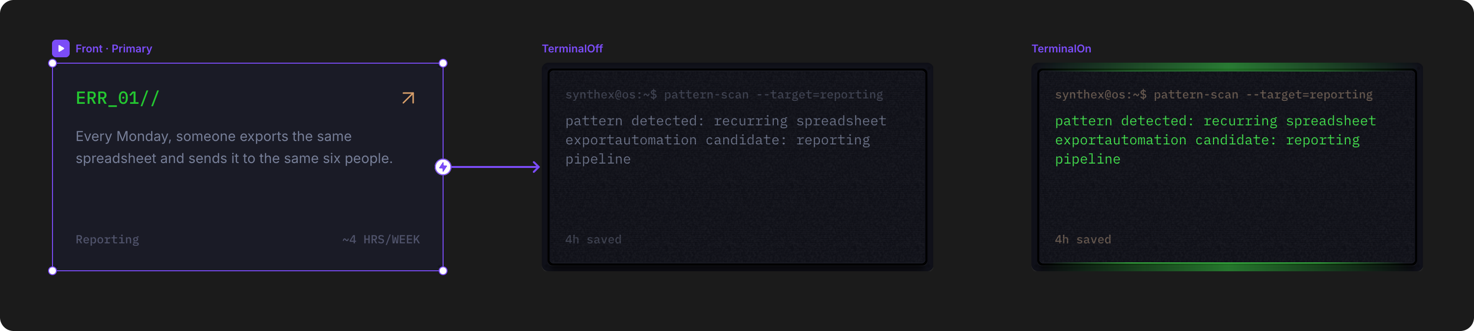
Variants
| Variant | Behavior | Use Case |
|---|---|---|
| Front | Initial state — shows pattern icon, title, description, and metrics | Default card display |
| TerminalOff | Hover state — reveals terminal output without highlighting | Transition state during animation |
| TerminalOn | Hover state — displays terminal output with TerminalPrimary highlighting | Final hover state with full terminal aesthetic |
Interaction is automated: hovering on the card transitions from Front → TerminalOff → TerminalOn.
How to Edit
To customize CardPattern properties:
- Select the component — Click CardPattern directly on the canvas, OR find it in the Layers panel and click its name
- Open Properties — The Properties panel (right sidebar) displays all editable fields
- Make changes — Edit any property and see changes update in real-time
Property Controls
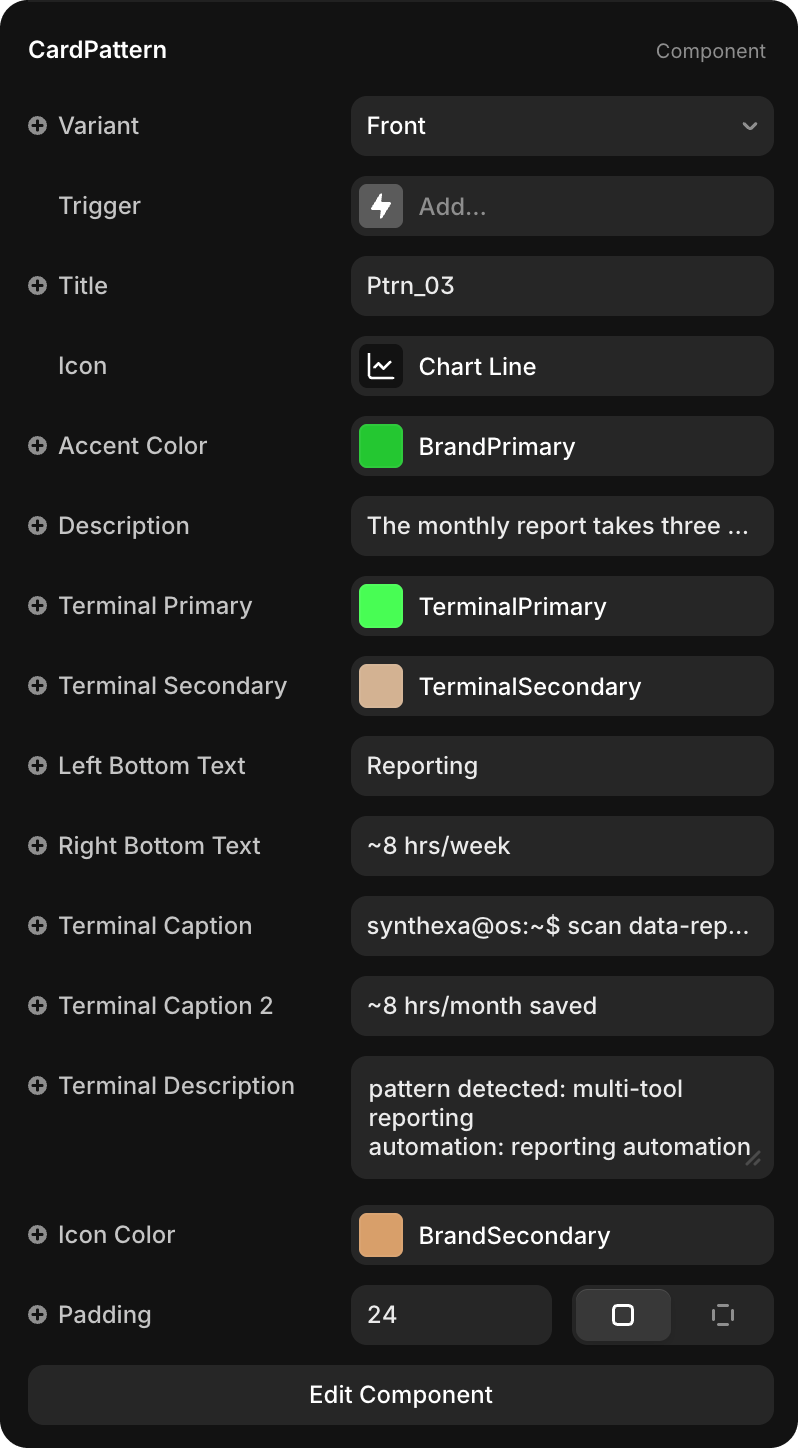
Appearance
| Property | Type | Description |
|---|---|---|
| Variant | Dropdown | Select which variant to display (Front / TerminalOff / TerminalOn) |
| Trigger | Interaction | Hover interaction that toggles between variants |
Icon & Color
| Property | Default | Description |
|---|---|---|
| Icon | - | Icon component displayed in the top-left corner (can be any Framer icon or custom component) |
| Accent Color | BrandPrimary | Color applied to the icon background shape |
| Icon Color | BrandSecondary | Color of the icon itself |
Content
| Property | Type | Description |
|---|---|---|
| Title | String | Pattern name (e.g., "Ptrn_01", "Reporting") |
| Description | String | Brief explanation of the workflow pattern |
| Left Bottom Text | String | Category or workflow type (e.g., "Reporting", "Onboarding", "Sales") |
| Right Bottom Text | String | Metric value (e.g., "~4 hrs/week", "~6 hrs/week") |
Terminal Elements
Terminal-themed display elements that appear in hover states:
| Property | Default | Description |
|---|---|---|
| Terminal Primary | TerminalPrimary | Primary color for terminal text and accents (bright green) |
| Terminal Secondary | TerminalSecondary | Secondary color for terminal borders and outlines (tan/beige) |
| Terminal Caption | String | Command-line style text (e.g., "synthexa@os:~$ scan reporting") |
| Terminal Caption 2 | String | Secondary terminal line showing result (e.g., "~4 weeks saved") |
| Terminal Description | String | Multi-line terminal output describing the pattern and automation opportunity |
Layout
| Property | Type | Default | Description |
|---|---|---|---|
| Padding | Number | 24 | Internal spacing within the card |