Appearance
Color Tokens
SYNTHEXA uses a structured color token system with three groups: Terminal (retro aesthetic), Brand (global identity), and Background/Text (layout foundations).
Change one token to update all instances across the entire site instantly.
Terminal Colors
Used inside TerminalDashboard, TerminalImage, and all CRT-style UI elements. The most frequently customized tokens.
TerminalPrimary
rgb(64, 255, 67)
/Terminal/TerminalPrimary
TerminalSecondary
rgb(217, 186, 154)
/Terminal/TerminalSecondary
TerminalLines
rgba(222, 233, 250, 0.2)
/Terminal/TerminalLines
Brand Colors
Global brand identity colors used in buttons, links, badges, and non-terminal UI elements. Independent from Terminal colors.
BrandPrimary
rgb(0, 207, 0)
/Brand/BrandPrimary
BrandSecondary
rgb(222, 168, 111)
/Brand/BrandSecondary
Background & Text Colors
Foundation colors for layout and typography.
Background Colors
BackgroundBase
rgb(42, 49, 71)
/Background/BackgroundBase
BackgroundElevated
rgb(21, 22, 36)
/Background/BackgroundElevated
BackgroundTop
rgb(28, 29, 44)
/Background/BackgroundTop
BackgroundCanvas
rgb(18, 20, 32)
/Background/BackgroundCanvas
Text Colors
TextPrimary
rgb(225, 230, 247)
/Text/TextPrimary
TextSecondary
rgb(129, 137, 163)
/Text/TextSecondary
TextMuted
rgb(90, 94, 120)
/Text/TextMuted
TextError
rgb(255, 105, 51)
/Text/TextError
Terminal vs Brand — What's the Difference?
Terminal tokens drive the retro CRT aesthetic. They're used in:
- Code components (TerminalDashboard, ROICalculator, NotFoundGame)
- Buttons and interactive elements
- Decorative effects
Brand tokens drive broader site accents like:
- Navigation states
- Badges
- Links
You can set them to the same color for a unified look, or keep them different for contrast.
How to Change Colors
Step 1: Open Color Styles
In Framer:
- Click Assets (left sidebar)
- Select Color Styles
Step 2: Find the Token
Look for the token you want to change:
- To change the main neon accent:
/Terminal/TerminalPrimary - To change brand color:
/Brand/BrandPrimary - To change body text:
/Text/TextPrimary
Step 3: Click the Color
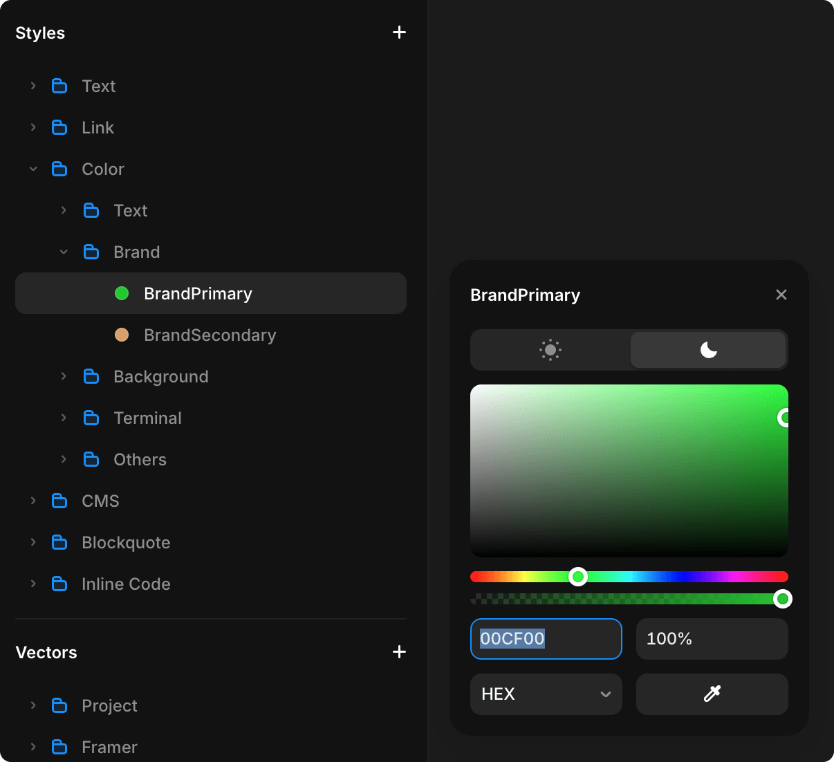
Click the color swatch to open the color picker.
Step 4: Choose Your Color
- Use the color picker to select your color
- Or paste a hex code (e.g.,
#00FF00) - For RGB:
rgb(0, 255, 0)
Step 5: Apply & Publish
All elements using that token update instantly across the entire site.
Click Publish to make it live.
Advanced: Light & Dark Mode
Each color token can have separate values for light and dark themes:
- Click a color token
- Look for Light and Dark variants
- Set different colors for each mode
- Framer auto-switches based on system preference
For a guide on how visitors can switch between light and dark modes on your site, see Switching Themes (Dark/Light Mode).
Color Accessibility
When choosing colors, consider:
- Contrast ratio — Ensure text is readable (WCAG AA minimum: 4.5:1 contrast)
- Colorblind safe — Test with colorblind simulators
- Dark mode — Make sure colors work in both light and dark modes
TIP
Test your color changes on both light and dark modes before publishing.
In Framer, click the sun/moon icon in the bottom toolbar to toggle between light and dark theme preview while you edit.

All Color Tokens Reference
Terminal Group
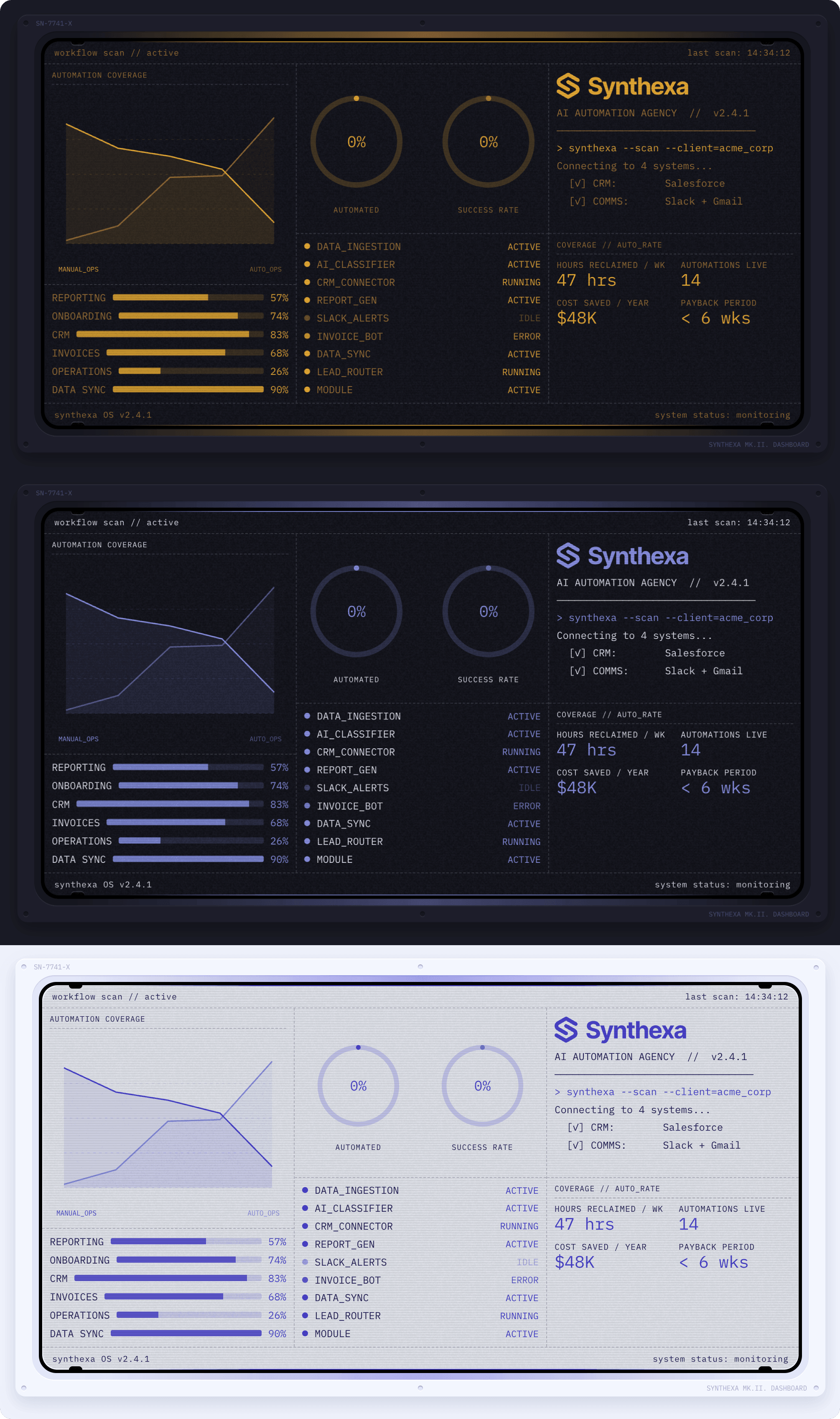
Drive the retro CRT aesthetic. Used in code components (TerminalDashboard, ROICalculator, NotFoundGame), buttons, and decorative effects:
/Terminal/TerminalPrimary— Main neon accent color/Terminal/TerminalSecondary— Secondary accent for contrast/Terminal/TerminalLines— Grid lines and borders in terminal elements
Brand Group
Global brand identity colors used for broader site accents like navigation states, badges, and links:
/Brand/BrandPrimary— Primary brand color for buttons and interactive elements/Brand/BrandSecondary— Secondary brand color for supporting UI elements
Background Group
Foundation colors for layout and page structure, organized by depth levels from top to bottom:
/Background/BackgroundHighlight— Highest level, used for forms, cards, and highlighted/featured elements (e.g., popular pricing plan)/Background/BackgroundTop— Main page and container background/Background/BackgroundElevated— Decorative UI elements: circular cutouts in panels, button/toggle indentations, slider tracks, dividers/Background/BackgroundSurface— Gaps and separators between panels (gutters, dividing spaces)/Background/BackgroundBase— Background layer for interactive elements (buttons, forms, inputs, terminals)/Background/BackgroundCanvas— Black color for pseudo-cutouts in panels (buttons, inputs, terminal screens)
Text Group
Typography colors for readability and hierarchy:
/Text/TextPrimary— Main body text and headlines/Text/TextSecondary— Secondary text and labels/Text/TextMuted— Disabled, subtle, or placeholder text/Text/TextInverse— Text on dark/colored backgrounds for contrast/Text/TextError— Error messages and warning text
Others Group
Used primarily for creating 3D effects through inner shadows and drop shadows on elements:
/Others/LightSubtle— Subtle highlight/glow for light effects/Others/LightStrong— Strong highlight/glow for pronounced light effects/Others/ShadowSubtle— Subtle shadow for soft depth/Others/ShadowStrong— Strong shadow for pronounced depth